The watch app gets a sky
A nearby personal weather station can tune your forecast to your own block, the background follows the real sky, hurricane forecast cones appear on the radar, and the Apple Watch app has a new design built around that sky.
A sky that knows what time it isiOS
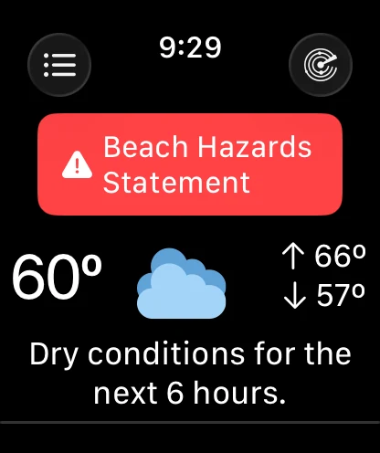
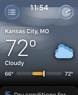
A watch screen gets looked at for about two seconds, and Forecast Bar was spending both of them on numbers. The main screen has been rebuilt around the opposite idea: before you have read anything, the screen should already have told you something.
So it has a sky now — not a stock picture, but a background drawn from where the sun actually is above your location and what the weather is actually doing. Cloud cover greys and flattens it, a storm darkens it, fog lifts it. It runs edge to edge behind the clock and fades to black, so every card below it still sits on a dark screen.
Rose and amber on the way downiOS
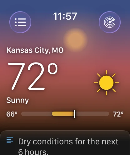
The colour comes from the sun's real elevation, not from a clock reading "evening". It moves between bands instead of stepping between them, so the screen you looked at an hour ago is not quite the screen you are looking at now, and the glow sits where the sun actually is rather than in a fixed corner.
Stars, and a moon in the right placeiOS
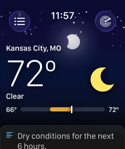
Once the sun is properly down and there is not too much cloud in the way, the stars come out. The moon takes the sun's place in the glow, at its own position and its own phase.
What the sky deliberately does not do is rain on you. Falling rain and snow were built, looked at on a watch, and taken out again — at that size a thin streak reads as a scratch on the glass rather than as weather. And it knows when to stop moving altogether: with Always On, Low Power Mode or Reduce Motion the sky holds still.
A week you can read in one lookiOS
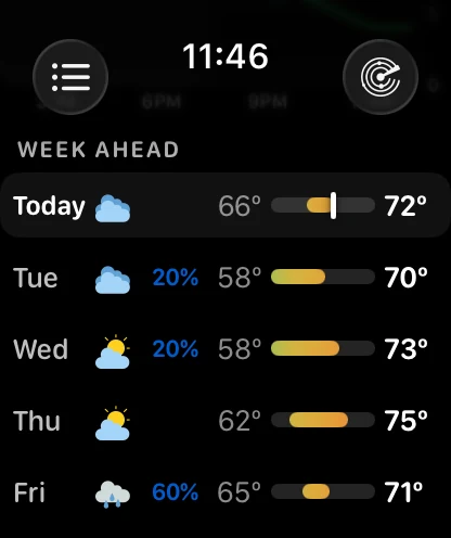
The days used to be a strip you pushed sideways, one column at a time. They are a list now, and the point of the list is the bars: every one is scaled to the same week, so a warm day's bar is visibly longer and further right than a cold one's.
That turns "is it worth taking a coat on Friday" into a shape rather than five numbers you have to hold in your head and compare. Today's row carries a marker showing where the temperature is right now inside its own range.
Data points became tilesiOS
The bottom of the main screen was a table of small numbers in mismatched type. It is a grid of tiles now, and each one is drawn the way its particular reading wants to be read: humidity as a ring that fills, wind as a compass needle, UV in the standard bands, pressure as a trend, dew point as a word you can actually act on.
Seventeen readings are available and you choose which of them appear, and in what order — which is new. The list used to be fixed.
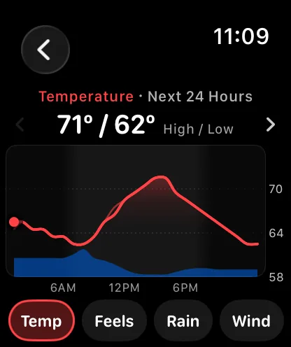
Tap one and its chart opens on that reading. Wind is the exception that goes somewhere better: it opens the Wind screen.
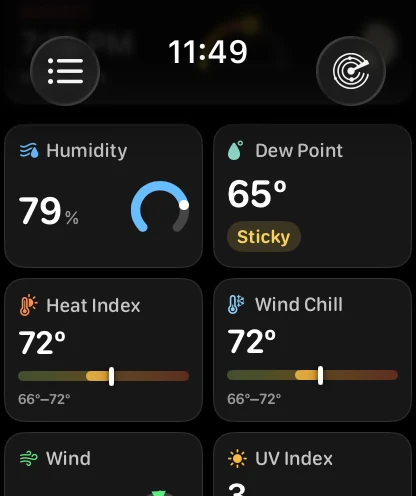
A tile tap stopped hijacking your chartiOS
If your charts kept opening on UV Index, this is why. Tapping a data tile used to write that reading in as the one the Charts section remembers, so a single curious tap three days ago quietly redecided what you saw every time afterwards. Now a tile opens its chart for the visit and leaves your choice alone; only the buttons under the chart change it. Charts open on Temperature until you pick something else.
Those buttons can also say their names rather than show icons, from Charts settings — Temp, Feels, Rain, Wind, and so on. A droplet and a dewdrop are not that easy to tell apart at this size.
Pollen, on your wristiOS
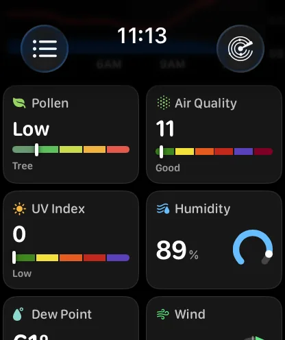
A Pollen tile, new in this round. The level in a word, a five-band gauge showing where in the scale it falls, and underneath it the type actually driving the count — tree, grass, weed or mold, which is the part that decides whether today is your problem or somebody else's.
It is a United States reading from The Weather Company's station network and it is part of Gold. The watch only asks for it once the tile is on your grid, so the first forecast after you add it fetches again; and when there is no reading to show, the tile isn't drawn rather than showing you a dash.
The sun's whole pathiOS
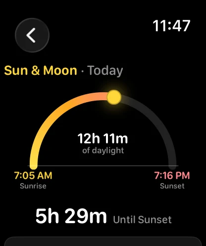
Sun & Moon is a new screen, and it draws the day as an arc rather than as two times in a list. The puck rides it where the sun actually is, with sunrise and sunset at its feet and the length of the day in the middle. Further down are first and last light, and the moon's phase.
Which way the wind is coming fromiOS
Wind is the other new screen, and the whole of it now fits on the screen. It first shipped as a big compass with the speed inside it and everything else a scroll away, which is a beautiful way to answer one third of the question. So the compass got smaller and moved left, the marker moved onto the ring where it can actually be read against the directions, and the speed, the description, the direction and the gusts came up alongside it.
Underneath, the next twelve hours with its low and its peak — no scrolling on a 46mm watch. Knowing the wind is 8 mph is worth much less than knowing what it does by five o'clock.
The gentlest end of the scale also stopped calling itself "Light Air", which is a term of art rather than an answer. It says Calm.
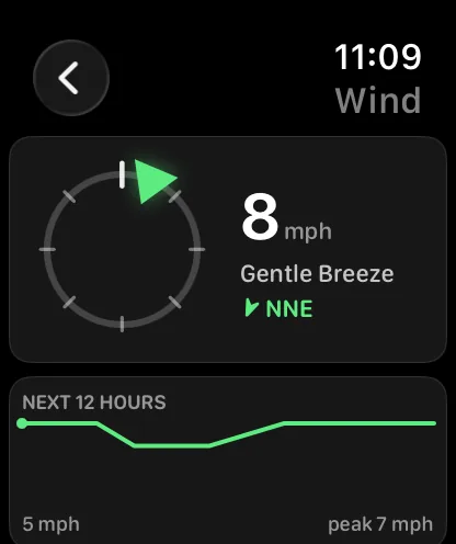
And on the small watch tooiOS
The compass is sized from the screen, not from the big one, so the 40mm watch gets the same layout rather than a squeezed version of it.
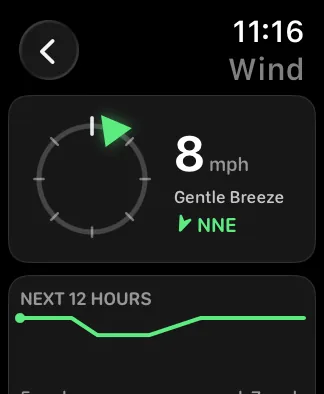
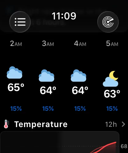
The hours, three waysiOS
The hourly strip has a Style setting now. Plain is the aligned columns it has always drawn. Curve is the one above: the hour labels stay fixed along the top while each hour's icon and temperature float by how warm that hour is, so the shape of the day arrives before any of the numbers do. It is the iPhone's Timeline curve, on the wrist.
Or as a single lineiOS
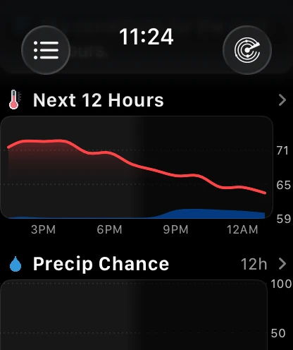
**And Chart replaces the strip outright**, drawing the same window as one temperature curve with the chance of rain behind it. Three different answers to "what do the next twelve hours look like", none of them more correct than the others, which is exactly why it is a setting. It syncs with your iPhone, and it is in Watch Layout there too.
Tap the chart and the full charts open on that curve, ready for the Digital Crown — the chevron in its corner says so. And the Charts section underneath does not draw the same temperature line a card later: while the strip is a chart, a Charts section left on Temperature switches to the chance of rain, or to wind on a dry day.
Rain in the next hour, minute by minuteiOS
The watch now asks Apple Weather for the next hour itself. The precipitation card has always drawn six hours in quarter-hour steps, which is the right window for deciding about this afternoon and the wrong one for deciding whether to run for it. Where Apple has coverage and something is actually falling, the card opens on Next Hour instead — sixty one-minute steps — with a 1 Hour / 6 Hours switch to step back out, and Apple's credit under the chart.
It is the watch making that call over its own connection, not the phone relaying it. There is nothing to turn on and no extra tier. When Apple has no answer for where you are, or the hour is dry, nothing about the card changes from what it has always shown.
Which window you prefer is now yours. Press 1 Hour or 6 Hours and that is the one the card and the screen open on next time, with the other standing in when your choice has nothing in it. The pills are the whole setting; there is no row for it anywhere.
The six-hour view also decides whether there is anything to show the way the iPhone does, so snow and the lightest traces count, not just rain.
Tap a day, see its whole shapeiOS
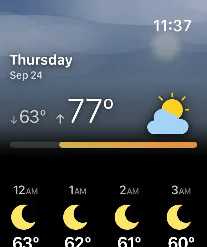
Every day's screen now opens under a sky tinted for that day's weather, with the date, the low and the high, and the chance of rain sitting on it. Below that: that day's own hours, the narrative forecast, and a chart of the day.
Any day, hour by houriOS
Every day's screen now carries that day's own hourly strip, not just today's — scoped to that date in the location's own time zone, with its sunrise and sunset marked in it. Looking up Friday and being told only its high and its low was always a slightly hollow answer.
The heading reads the low first, on the left, with the high beside it. So does the range bar on the main screen, so does every row of the Week Ahead, and all of them are scaled to the same week — which they were not, quite, in the first build. A day cannot look warmer in one place than in another any more.
The day and the night, told apartiOS
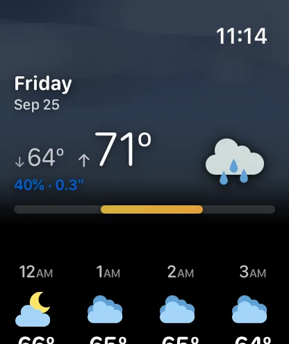
Further down the same screen, the day and the night are summarised separately — each with its own icon, chance of rain, humidity, cloud cover and wind, and UV on the day side. A clear afternoon followed by a wet night is two different pieces of information, and it used to be averaged into one.
Underneath sits that date's sun row. Sunrise and sunset are given in the location's own time zone now, so a saved city three zones away finally reads correctly instead of being converted to your wrist.
Or none of the sky at alliOS
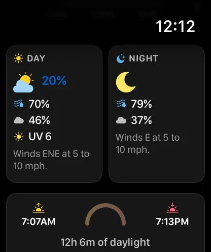
If the sky is not what you want from a watch, it is one setting away from gone. The Compact header drops it entirely for a tight block of numbers on black, at about half the height, so the next section starts on the first screen.
That is one of three presets. Glance is now-and-next and nothing else, Balanced is the arrangement most people will want, and Everything turns on every section there is — each of them one tap.
Every section, where you want itiOS
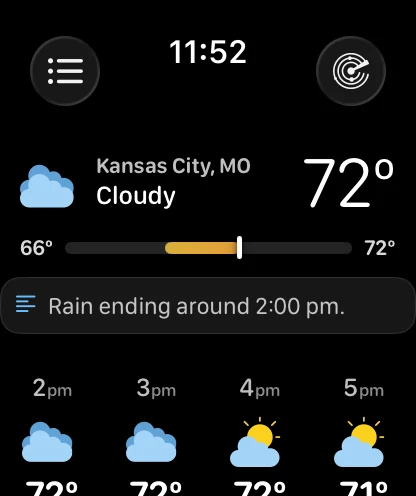
The main screen used to be reorderable and nothing more. Now every section can be shown, hidden or moved, the tiles are yours to pick, and the hourly strip and the week have their own options.
The Layout screen opens with a live preview of your own main screen at the top — your order, your hidden sections, your header style, your weather. Not a drawing of one. The old preview was a fixed picture that had quietly drifted out of date.
Data Points now sits above Week Ahead out of the box, because the readings you check are worth more scroll-priority than a week you look at once a day. If you had already put the sections in your own order, yours is left exactly as it is; only a layout nobody had touched moves.
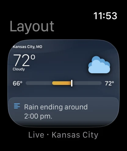
Settings that open on the appiOS
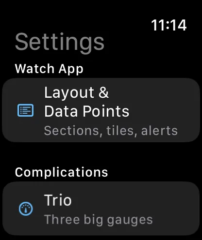
The watch app's own Settings screen used to open on complications, with the watch app's own layout second, and it closed with a short lecture on how to add a complication to a watch face. The order is the other way round now, and the lecture is gone — you were in the app's settings, not on a watch face.
Arrange it on the iPhone insteadiOS
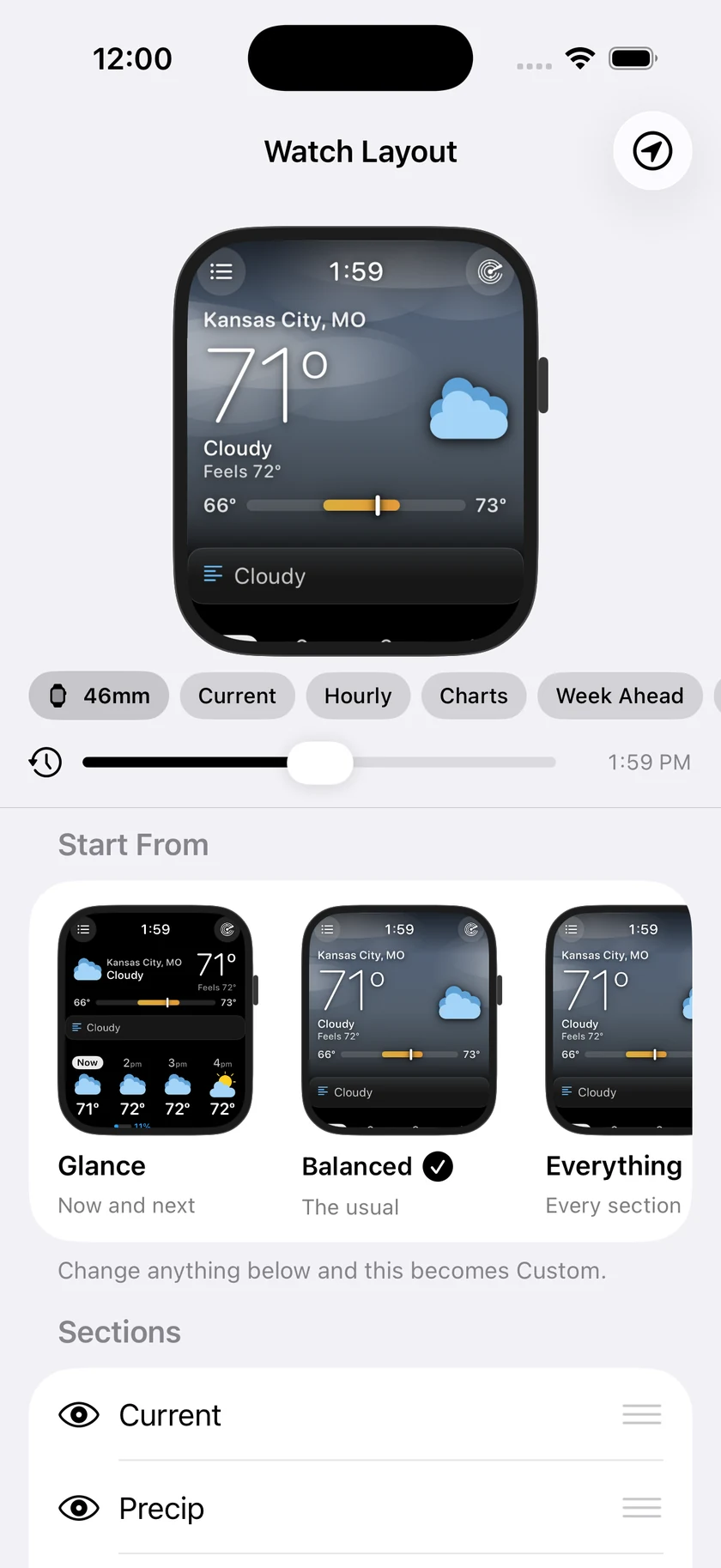
On the phone, Watch Layout does the same job on a screen you can actually see. The watch pinned at the top is not an illustration of your watch screen — it is your watch screen, the same views the watch runs, with your own weather in them. Reorder a section and it moves. Hide one and it goes.
There is a 46mm / 40mm toggle so you can check the small screen, chips that jump the preview to a section, and preset cards that show each preset rendered with your weather before you commit to it.
Then drag the day past itiOS
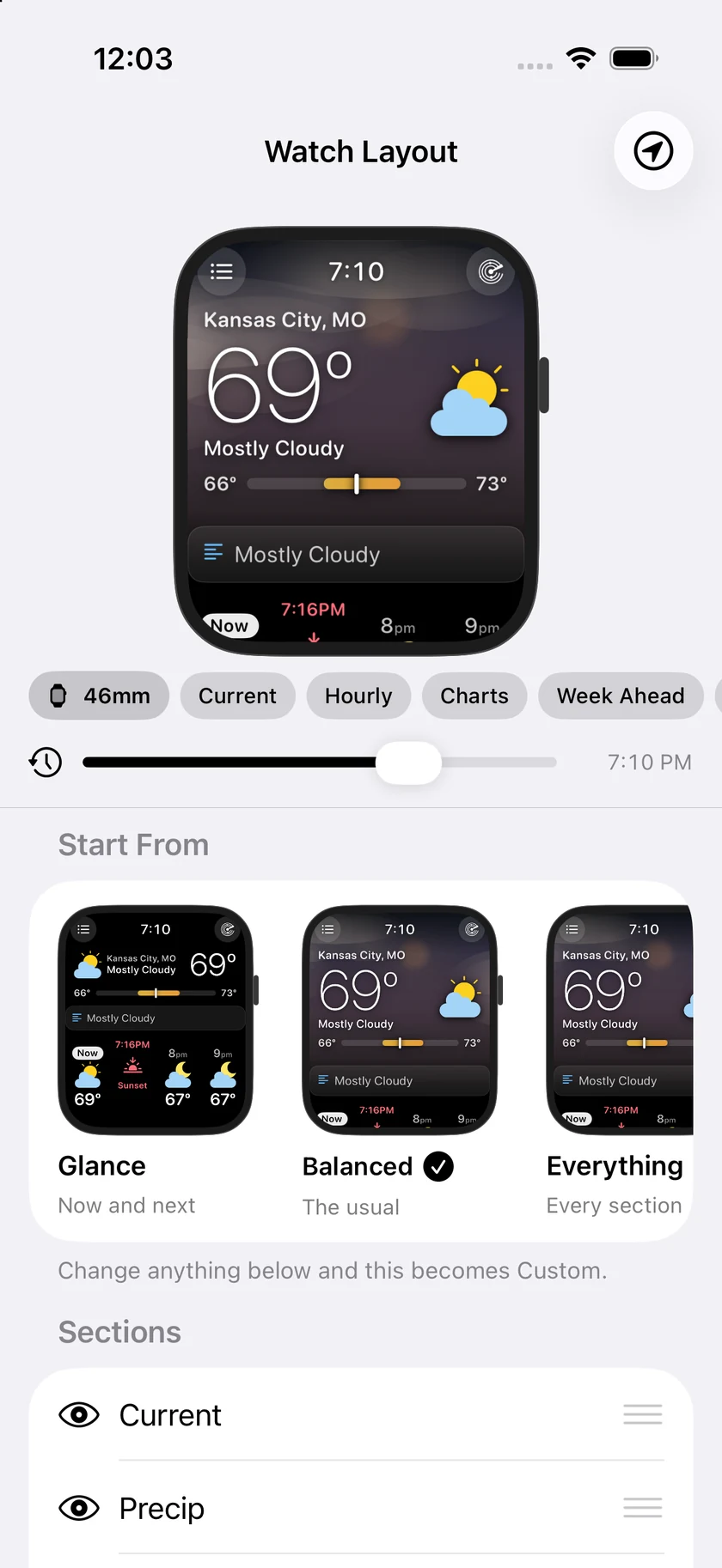
The timeline under the watch runs midnight to midnight. Drag it and the day goes by: the sky turns from dawn to blue to gold to black, the sunset cell slides along the hourly strip, the sun travels its arc, and the temperature follows the hourly forecast. A Now button snaps it back.
There is a Sample Day to scrub through as well — morning fog, an afternoon storm, a clear night — so you can see every state the screen can be in without waiting for the weather to do it.
Small watches tooiOS
All of it was designed for a 40mm screen as well as a 46mm one, which is the part of a redesign that is easy to say and tedious to actually do: no widths derived from the big screen, nothing truncated, nothing shrunk past the point of being readable.
Turn the Crown, walk the weekiOS
The watch has had the numbers for a long time. What it has not had is a way to look at the shape of them. A high and a low tell you very little about whether the rain arrives before you leave or after you get back, and a strip of twelve icons is a summary, not something you can interrogate.
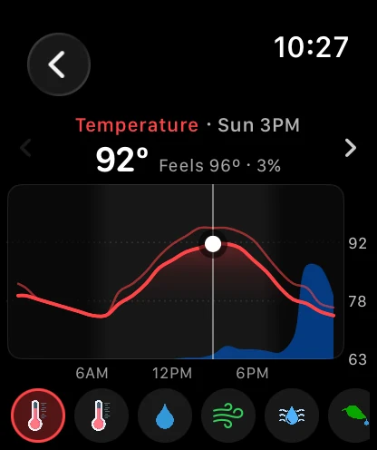
11.7 puts a real chart on the watch. Open it and turn the Digital Crown to move through the forecast hour by hour — and keep turning, because it does not stop at the end of today. The chart rolls on into tomorrow and the day after, about a week out, which is further than the watch app has ever been able to show you.
Choose what it plots: temperature, feels like, chance of rain, wind, humidity, dew point, heat index, wind chill, UV, cloud cover, pressure or visibility, drawn the same way as the charts on iPhone so there is nothing new to learn. The main screen carries a Charts section covering the next twelve hours, and every day's detail screen now opens with that day's chart rather than a list.
Heat index and wind chill, chartediOS
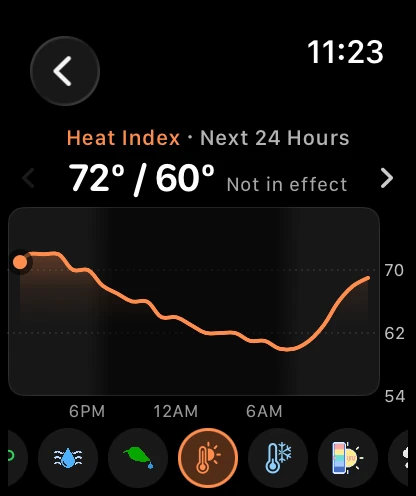
Heat Index and Wind Chill have charts of their own, and tapping either tile opens its chart. Each follows the forecast hour by hour, with the air temperature it is measured against in the readout.
On a mild day neither one applies, and both simply equal the temperature. Rather than leave you wondering why the "wind chill" is 72º, the chart says Not in effect.
The two tiles read the same current observation as the Feels Like tile, so the three always agree: the heat index is the feels-like temperature when it is above the air temperature, and the wind chill is the feels-like temperature when it is below.
Weather that is never quietly oldiOS
Open the watch app and you get your forecast at once, provided it is under ten minutes old. Fresh weather replaces it a moment later, with no loading screen in between. Returning to the app and pressing Refresh work the same way: the forecast stays up while the new one is fetched.
Older than ten minutes, and you see the loader until fresh weather arrives. A forecast from three hours ago looks exactly like one from three minutes ago, and showing it without a word would be a wrong answer. The loader also shows when the forecast on screen is for the wrong thing — a different city picked from the list, a change of units, or a location fix more than about 25 km from the place that forecast is for. And if a refresh fails, the forecast stays on screen only while it is still under ten minutes old.
Your locations, straight awayiOS
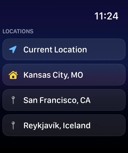
The location list opens at once, with the list the watch already has, and checks your synced list in the background — updating in place, and keeping what it had if that check fails.
The city your iPhone calls Home is marked with a house, as it is on the phone. Current Location keeps its arrow, even when you are at home.
A few things on the iPhone, while we were hereiOS
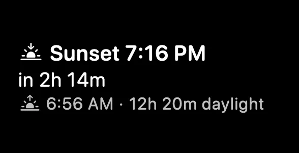
A Sunrise & Sunset Lock Screen widget, in all three shapes. The circular one is a thick ring that fills toward the next event, with the sun riding the fill, the time large in the middle and no AM or PM, because the glyph in the ring's opening already tells you which one you are waiting for. The rectangular one names the event, counts down to it, and gives you the other end of the day and how much daylight there is between them. The inline one puts all of that on the line above the clock.
And on the iPhone, "Show Temperature as Curve" stopped being a switch. It is two cards side by side now, each drawing three real hours of tomorrow's forecast in its own style, so you choose the one that looks right rather than flicking a toggle and going to look for what changed.
The rain and Storm Intercept Live Activities stay readable when a phone call shares the Dynamic Island. The squeezed pill used to break "Rain" over two lines; it now shows the rain icon on its own when the word will not fit, and the expanded readings stay on one line.
Complications you can actually readiOS
A complication has a few square millimetres to work with, and Forecast Bar was spending them badly. On the Smart, 5 Day and Data Point Graph complications the current conditions and today's high and low ran together into a single line, so you had to parse it rather than read it. The high and low now sit on the right with an arrow each, the current temperature and its condition share one colour, and the high and low are red and blue. Nothing new was added — the same numbers are simply laid out so you can take them in at a glance.
Those complications understand a tinted watch face now, too. A tinted face hands every complication two tones to work with, and Forecast Bar used to ignore them and render as one flat block. Home Screen widgets on the iPhone got the matching fix: on a tinted Home Screen the weather icons keep their shading instead of flattening into white silhouettes, so a cloud still looks like a cloud.
And on the smallest watches, where there is least room of all, the 5 Day complication no longer cuts off its title or the bottom of its temperatures.
The small things that were quietly wrongiOS
Three fixes in this release are the kind you only notice because they annoyed you every day.
The circular Cloud Cover, Dew Point, Humidity and Visibility complications used to sit on a grey placeholder instead of drawing their gauge. They draw now. The Pressure complication showed the wrong reading and ignored your unit and 24-hour settings; it follows them. And the Trio presets showed up in the complication picker without their names, which made choosing one a guess — they are named again.
Just after midnight, the watch used to report today's high as though the day had not started, open the daily strip on yesterday, and drop the next sunrise from the evening hourly strip. All three read correctly now.
Finally, the loading screen is drawn by the watch rather than played as an animation file: a glowing ring circles a location pin while the app finds you, then the pin gives way to sun, cloud, rain, storm, snow and night as your weather arrives.
Plus 77 smaller changes — fixes, tidy-ups and one-line wins that didn't need a paragraph. See every line →
Everything in this release
Your own weather stationiOS
- Weather Station (Gold) shows current conditions from a nearby personal station, or your own. Tune My Forecast learns how your station's spot runs, so the coming hours and daily highs and lows fit where you actually live, in the app, widgets and on Apple Watch.iOS
- Tune for My Neighborhood shifts forecasts by how your part of town usually runs, Apple Weather included, and Station vs. Forecast shows day by day whether tuning helps.iOS
- Explore Your City's Microclimates: a live map of every station around you, a two-day replay, and your area's typical day.iOS
A sky that matches the real weatheriOS
- The realistic background follows the real sky: cloud layers, rain and snow by type and rate, rainbows, sun halos, fog, haze and smoke.iOS
- Clear nights show real stars, planets and the Milky Way, with meteor showers and auroras, turned toward the best view. The moon shows its real surface.iOS
- Sky, sun and clouds sit behind the hills, trees and buildings in your photo, in Visualize Day too, and wind-blown rain and snow fill the whole screen.iOS
- A Visualize Day widget in four sizes shows the scene for this hour. Tap it to watch the day unfold, or show just the current conditions.iOS
Hurricane tracking (Gold)iOS
- Each storm's forecast cone, track and forecast points on the radar, with coastal watches and warnings and NHC's 7-day outlook for where storms may form. Tap a storm for its winds, pressure and movement.iOS
- A card on the main screen, and optional Hurricane Cone Alerts, when your location falls in a storm's cone. Storm Surge and Extreme Wind Warnings can break through Do Not Disturb.iOS
Apple Watch, redesignediOS
- A new main screen with a sky that matches the weather, a range bar for today, an hourly strip in three styles, a Week Ahead list and data tiles you choose. Arrange every section from your iPhone, where Watch Layout shows your real watch screen as you go.iOS
- New day, hour, Sun & Moon and Wind screens, a Pollen tile, 6-hour precipitation by type and Apple Weather's minute-by-minute rain for the next hour.iOS
- Interactive charts you scrub hour by hour with the Digital Crown, a week out: temperature, rain chance, wind, UV, humidity, pressure, heat index, wind chill and more.iOS
- Weather alerts appear as a card above current conditions. Complications show highs in red and lows in blue, follow tinted faces and fit smaller watches.iOS
Everything elseiOS
- Show Overnight Lows, in Data & Layout, gives each day the low of the night that follows it.iOS
- Radar starts playing sooner and uses far less data while it loops.iOS
- Smart Weather Stories load faster, open each day with what sets it apart, and work late at night. Quick stories are shorter.iOS
- Life-threatening warnings can't be hidden, alert mute settings say what they can't silence, and AMBER and Blue Alerts no longer appear.iOS
- A Sunrise & Sunset Lock Screen widget, and the temperature curve setting is now a picker that draws both timelines.iOS
- Rain and storm Live Activities stay readable in the Dynamic Island beside a call or another app's activity.iOS
- Siri and Shortcuts read cleaner forecast sentences, and widgets keep the right hours in half-hour time zones such as India.iOS
- Settings has a Rate Forecast Bar row, and after an unexpected close you can send a quick bug report.iOS
- Smart and Single Location widgets keep their usual layout when rain is past the hours they show, and backgrounds fall back to a built-in scene when a chosen city pack is gone.iOS
- The Current Weather widget's summary moves on with each hour, and on iPad its tall size adds today's written forecast.iOS
- Lightning haptics stop after three taps per storm, then rest for half an hour.iOS
- Hourly graph hour labels show in full instead of "…".iOS
- Widgets say "until" the hour the next condition starts, not an hour later.iOS
- Weather Station (Pro): current conditions from a nearby personal station, or your ownMac
- Tune My Forecast: coming hours and daily highs and lows learn how your station's spot runsMac
- Tune for My Neighborhood: forecasts shift by how your part of town usually runs, Apple Weather includedMac
- Widget forecasts use your station's tuningMac
- Explore Your City's Microclimates: a live map of every station around, a two-day replay, and your area's typical dayMac
- Station vs. Forecast: your station and the forecast day by day, and whether tuning helpsMac
- The realistic background follows the real sky: cloud layers, and rain and snow by type and rateMac
- Clear nights show real stars, planets and the Milky Way, with meteor showers and aurorasMacTV
- The night sky turns toward its best view, like the Milky Way's core or OrionMacTV
- Stars, the sun and moon, clouds and rainbows sit behind the hills, trees and buildings in your photoMac
- Rainbows, sun halos, fog, haze and smoke appear when conditions allowMacTV
- Rain falls in fine streaks and snow in soft flakes, with the nearest ones out of focusMacTV
- Wind-blown rain and snow fill the whole screen, not just one sideMacTV
- In Visualize Day, stars, the sun and clouds stay behind the skyline tooMac
- The moon shows real surface detail and no longer flashes a white square at nightMac
- AMBER and Blue Alerts no longer appear, and life-threatening warnings can't be hiddenMacTV
- Alert mute settings say which warnings they can't silenceMac
- Radar uses far less data while it loops and when you move the mapMacTV
- Hurricane tracking (Pro): each storm's forecast cone, track and forecast points on the radar, with coastal watches and warningsMac
- Tropical Outlook (Pro): NHC's 7-day areas where tropical storms may form, as its own radar layerMac
- Click a storm for its winds, pressure, movement and forecastMac
- A card in the main window when your location is in a storm's forecast coneMac
- Hurricane Cone Alerts: know when a storm's forecast cone first covers your locationMac
- On macOS 13, 14 and 15, the welcome window appears at first launch again, and opens in front of your other windows, so setup can be finishedMac
- Startup finishes and the menu bar icon keeps responding when location access is turned offMac
- Current conditions and widgets stay up when a forecast arrives without daily dataMac
- Settings has a Rate Forecast Bar button that opens the Mac App Store review pageMac
- The rating request waits for a good moment and skips times something went wrongMac
- Smart Weather Stories load faster, and each day's story opens with what sets that day apartMac
- Late at night, Smart Weather Stories start with the rest of tonight and load reliablyMac
- Quick Smart Weather Stories are shorter and punchierMac
- The Smart Weather Stories AI Model menu lists each option onceMac
- "Show Temperature as Curve" is now a picker with both timelines drawnMac
- Widgets show the right hours and times in half-hour time zones such as India and AdelaideMac
- Smart and Single Location widgets keep their usual layout when rain is past the hours they showMac
- The background falls back to a built-in scene when a chosen city pack is goneMacTV
- Show Overnight Lows, in Data & Layout, gives each day the low of the night that follows itMac
- Precip Chance in the menu bar shows the forecast chance instead of 0%Mac
- The Subscription window always opens in front, at a usable sizeMac
- The detached panel opens docked when its saved position is off every screenMac
- The Current Weather widget's summary moves on with each hourMac
- The tall Current Weather widget shows today's written forecastMac
- Widgets say "until" the hour the next condition starts, not an hour laterMac
- The docked panel keeps its height after being detached and closed, and a detached panel reopens where you left it after a relaunchMac
- Animated Weather follows the actual sky: cloud layers, and rain and snow by type and rateTV
- The moon shows real surface detailTV
- Hurricane tracking (Gold): each storm's forecast cone, track and forecast points on the radar, plus NHC's 7-day Tropical OutlookTV
- A home-screen card when your location is in a storm's forecast coneTV
- Current conditions stay on screen when a forecast arrives without daily dataTV
- Show Overnight Lows, in Settings, gives each day the low of the night that follows itTV
- Top Shelf says "until" the hour the next condition starts, not an hour laterTV
