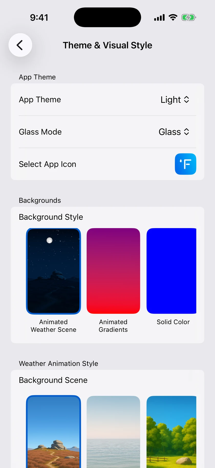
Everything about how Forecast Bar looks lives in one place: Settings → Theme & Visual Style (open the side menu, tap Settings, then the first row). Changes apply immediately, so it's easy to experiment.
App Theme
Choose whether the app uses light or dark colors.
| Option | What it does |
|---|---|
| Light | Always use the light appearance |
| Dark | Always use the dark appearance |
| Auto (default) | Follow your device's system appearance |
Glass Mode
On iOS 26 and later, a Glass Mode slider controls how frosted the translucent "liquid glass" look is. Drag from clear glass at one end to the app's traditional appearance at the other; the label beside the slider always names where you are:
| Label | What you get |
|---|---|
| Glass (default) | Clear glass with subtle tinting |
| Misted | Between Glass and Frosted Glass |
| Frosted Glass | The midpoint — more opacity, a softer look |
| Iced | Between Frosted Glass and System |
| System | The traditional look, without glass effects |
Glass, Frosted Glass and System are anchor points. Let go of the slider near one and it settles exactly onto it, so you can always get back to a known setting.
Touch the slider — or tap the Glass Mode row — and the app swaps in a full-screen preview so you judge the look against your real background rather than against a settings list. The slider stays under your finger while the preview grows around it. Let go and you are back in Settings.
This slider only appears on devices running iOS 26 or later. If you set Glass Mode on an earlier version of the app, your choice carries over to the matching point on the slider.
Select App Icon
Tap Select App Icon to choose from 32 app icons — the classic look, color variations like Blue, Green, Ocean Mist, Sunrise, and Sunset, plus a large gallery of numbered designs. Tap any icon to apply it; the current choice shows a checkmark.
Tip: Every icon shows a temperature on it, and it automatically renders as °F or °C to match your Units setting in Data & Layout.
Choosing your app icon is included with Silver and above — see Plans & Subscriptions.
Backgrounds
The Background Style picker sets what's drawn behind your forecast:
| Style | What you see |
|---|---|
| Animated Weather Scene (default) | A living scene that matches current conditions — rain falls, clouds drift, the sky changes with the time of day |
| Animated Gradients | Slowly shifting color gradients; pick your own 3 custom colors (defaults: blue, purple, red) |
| Solid Color | A single color of your choice (default blue) |
| Custom Image(s) | Your own photos — pick up to 10 images from your photo library and the app rotates through them |
| Light / Dark | A plain background that follows the app theme |
| Map | A live map of your location behind the forecast |
When Map is selected, a Map Style picker appears with 5 styles: Standard, Satellite, Hybrid (default), Satellite Flyover, and Hybrid Flyover.
Weather Animation Style
When the background is set to Animated Weather Scene, the Animation Style picker controls how weather effects are drawn on top of the scene:
| Option | What it does |
|---|---|
| None | Scene only, no weather effects |
| Realistic (default) | Lifelike rain, snow, and cloud effects |
| Flat | Simplified, stylized effects |
| Cartoon | Playful, illustrated effects |
Background Scenes
Also under Animated Weather Scene, a row of scene cards lets you pick the landscape itself. Forecast Bar ships with a set of bundled scenes — the default is Highlands — plus a gradients scene. City packs are not cards here: they appear on their own, for the city you're looking at, and step aside when it isn't on screen.
- Tap a card to select that scene.
- Long-press a card to preview all 72 variations of the scene — every combination of weather condition and time of day — in a browsable sheet.
If a nearby city scene is currently overriding your pick (see below), a caption explains why, with a Use my choice instead button to switch back.
Background Packs (city scenes)
At the front of the scene card row, a Get More Packs card opens the Background Packs store, where you can download beautifully rendered scenes of real cities. Downloading packs requires Gold — see Plans & Subscriptions. The card only appears once packs are available.
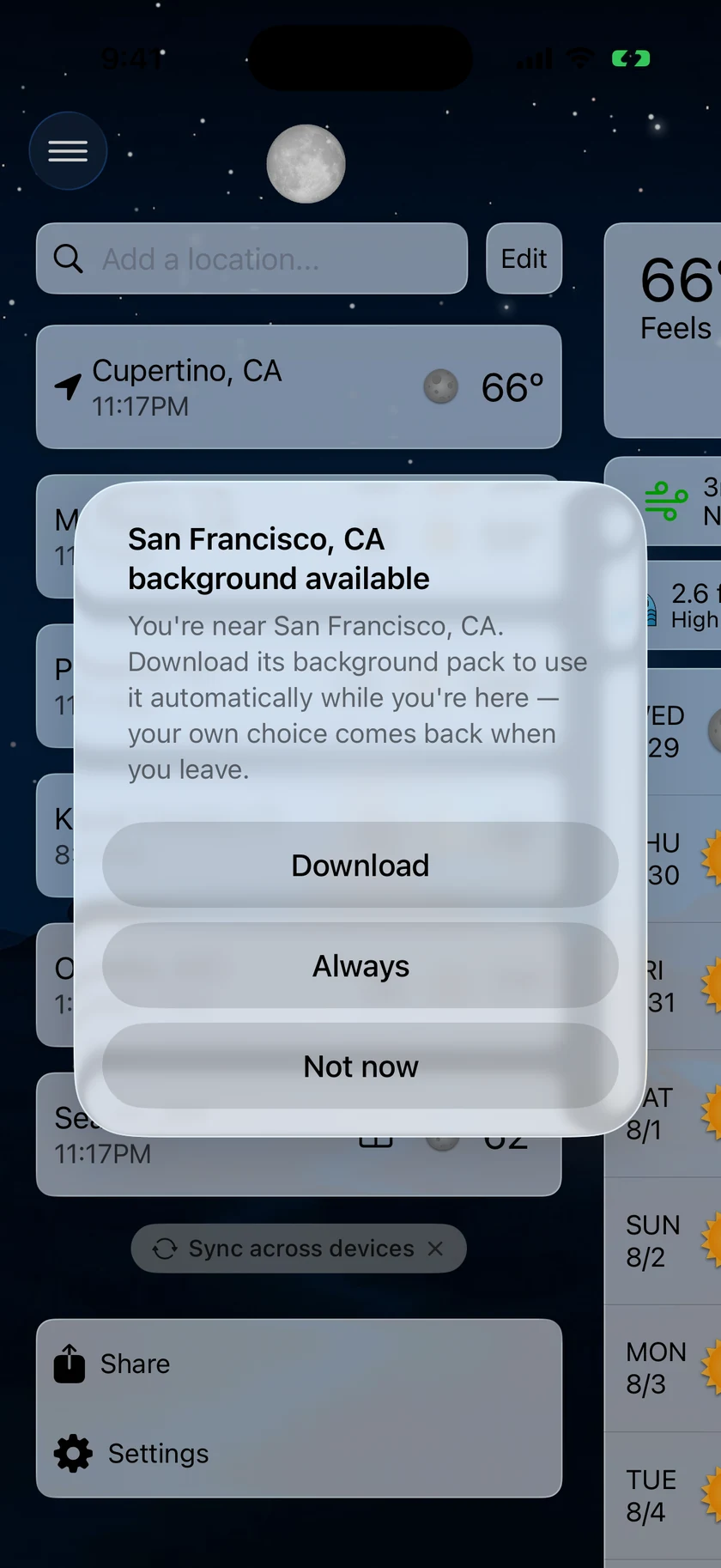
When you're near a city whose pack you haven't downloaded yet, a card for that city leads the row ahead of Get More Packs, and tapping it downloads that pack.
In the store you can:
- Browse the pack catalog, grouped by region, with each pack's download size shown. Packs run from about 8 MB to 26 MB, most of them near 20 MB, because each one carries 72 renderings of the city — every weather condition at every time of day.
- Download a pack, or Remove it from its row's context menu to free up space (the app confirms first). A line at the bottom shows how much space packs use on this device.
- Remove All Downloads clears every installed pack in one tap, once you have at least one.
- Pull down to refresh the catalog.
- Request a City Pack — from 11.4 this files a real request instead of opening an email. The city you're already viewing takes one tap; anywhere else is one field. Requesting needs Gold.
Your requests then sit at the top of the store, above the catalog, each one showing where it got to: Requested — we'll take a look, then In the queue to be created, then Being created now, then Ready — tap to download, with a notification when it lands. Ask for somewhere an existing pack already covers and you skip the queue entirely — the row names the pack that covers you and offers it straight away. A pack you asked for keeps a star on its row afterwards. Long-press a request to Cancel Request while it's still open, or Remove from List once it has settled; a city you cancel can be asked for again later.
From 11.4 a pack you already have also re-downloads itself quietly when we redraw its artwork, under the same Wi-Fi rule as automatic downloads. You no longer have to notice an Update available badge and tap it.
Automatic behavior is controlled by nested switches at the top of the store. Each one only appears when the switch above it is on:
| Setting | Default | What it does |
|---|---|---|
| Use Nearby City Scenes | Off | When you're near a city whose pack you have, its scene is shown automatically. Your own choice comes back when you leave |
| Download Nearby Packs Automatically | Off | Fetch nearby city packs in the background. Over Wi-Fi only unless you turn on the row below |
| Use Cellular Data | Off | For unlimited plans. Low Data Mode is always respected |
Weather Icons
Choose the icon set used for conditions throughout the app:
| Option | Look |
|---|---|
| Color (default) | Full-color, detailed weather icons |
| Climacons | Minimal line-style icons |
| Anusha | A hand-drawn illustrated set |
| Flat Color | Simple flat-color shapes |
Data Point Icons
The small icons next to data points (humidity, wind, UV, and so on) can be Colored (default) or Monochrome.
Fonts
- Font — keep Use System Default or pick any font installed on your device.
- Font Size — a slider from −3 to +3 in whole steps (default: 0, labeled Default) scales text throughout the app.
Precipitation Colors
Customize the colors used for each precipitation type in charts and graphs. There are two full sets of color pickers — one for Light appearance, one for Dark — each covering:
- Rain
- Snow
- Sleet
- Freezing Rain
- Mix
A Reset to Defaults button appears once you've customized any color.
Note: Your precipitation colors follow you beyond the main app — they also color the chart in the precipitation Live Activity and the graphs in the Apple Watch app.
Sync Appearance Across Devices
Everything on this screen is shared between your devices by default, so the look you set on your iPhone arrives on your iPad, Mac and Apple TV too. At the foot of Theme & Visual Style there is one switch, Sync Appearance Across Devices, that lets a device keep a look of its own instead.
- On (the default) — appearance changes apply to all your devices.
- Off — appearance changes stay on this device. Whatever the device looks like at the moment you switch it off is kept, so nothing changes on screen straight away; only your later edits stop travelling.
Turning it back on matches the device to your other devices immediately, rather than waiting for the next sync.
The switch is per device, so you can keep, say, a dark Mac and a light iPhone while your iPad keeps following whatever you set elsewhere.
Note: The switch only appears when you are signed in — without an account there is nothing to sync. See Sync & Sign-In.
