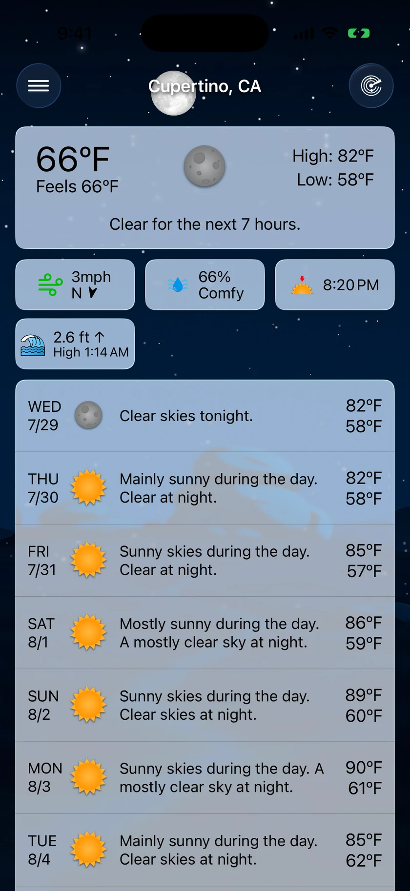
The main screen is Forecast Bar's home: one scrolling view with everything from right-now conditions down to the extended forecast. Almost everything on it is tappable, and almost everything about it can be customized in Settings → Data & Layout.
Current conditions
The top of the screen shows your current conditions — temperature, condition, and a summary for the selected location. Tap the current conditions card to open the detail screen with a full graph and every measurement for today. See Data Points & Details.
Data point tiles
Below the current conditions sits a row of tiles — humidity, wind, UV index, sunset, and any other data points you've chosen. Each tile shows the current value; tap a tile to open its detail screen.
- Rearrange in place: long-press a tile, then drag it to a new position in the row.
- Choose which tiles appear: Settings → Data & Layout → Main Screen Data Points → Add or Remove Data Points. You can also toggle tile icons and labels there, or hide the row entirely.
Precipitation section
When precipitation is expected, a chart section appears with up to three tabs. Each tab only shows up when its data is available, and the tab bar hides entirely if only one view is available.
| Tab | What it shows | When it appears |
|---|---|---|
| 1 Hour | Minute-by-minute precipitation intensity for the next hour | When minute-level data shows precipitation coming |
| 6 Hour | Precipitation in 15-minute steps over the next 6 hours | When precipitation is expected in the next 6 hours |
| Radar | A live mini radar map centered on your location | Gold subscribers, with Show Mini Radar Map on, inside radar coverage |
The mini radar map is a Gold feature — below Gold the tab shows a lock overlay with an upgrade button. The mini map has its own play/pause button and a small timeline scrubber (toggle it with Settings → Data & Layout → Precipitation Section → Show Mini Map Scrubber). Tap the Radar tab a second time (or tap the map) to expand into the full-screen Radar.
Pick which tab wins by default with Settings → Data & Layout → Precipitation Section → Default View (1 Hour, 6 Hour, or Radar — the app falls back to the next available view when your choice has no data).
Hourly graph
Under the precipitation charts is an hourly graph of the next six hours. It defaults to temperature, and a small picker above the graph lets you switch it to any chartable data point. Touch and drag across the graph to read exact values per hour. Gold subscribers with a forecast source chosen also get an eye button in the graph header: turn it on and the other source's forecast is drawn over the chart as a second line — where the two lines separate is where the next few hours are least settled. Configure it under Settings → Data & Layout → Hourly Forecasts (default chart data point) and Precipitation Section → Show Hourly Graph to hide it.
Daily forecast
The extended forecast lists the days ahead. Two styles are available under Settings → Data & Layout → Daily Forecasts → Daily Forecast Style:
- Summary (default) — condition icon, summary text, precipitation chance, and the high/low range for each day.
- Compact — a dense row with up to four data points of your choosing (six on iPad).
Tap a day to expand it into an hour-by-hour view — either a Timeline or a Graph, depending on your Hourly Forecasts style setting (a style switcher appears in the row itself unless you turn off Show Style Changer in Forecast). Tap any hour in an expanded day to open the detail screen for that exact hour. See Data Points & Details.
Cards
Cards appear between sections when there is something to say. The severe weather cards come first, in this order, and the whole block sits above the What's New, tip and promo cards so a storm is never buried:
- Storm Tracker — when a storm cell is closing on your location, a card leads with the verdict — on track for you, or Expected to miss you — with a live countdown to arrival. It sits directly above the precipitation section. On iOS 17.2 and later a Track on Lock Screen button at the foot of the card turns on Storm Intercept in one tap and says whether this storm starts tracking right away or once one is on track to reach you within about 30 minutes. Gold; see Severe Weather.
- Severe alerts — active watches and warnings for your location, tappable for full details. Touch and hold the ✕ on an alert to hide every alert of that kind — see Hiding alert types.
- Storm Report — after a tracked storm passes, a card records what actually happened. Dismiss it with the ✕; the full history stays under Settings → Notifications → Severe Weather → Storm Reports.
- Severe Risk — on the rare day the national outlook reaches Enhanced or higher, this card leads the forecast. Tap it to see the outlook drawn over the radar. It steps aside while a cell is being tracked and returns once it passes.
Then the informational cards:
- What's New — highlights after an update; tap to expand, or tap ✕ to dismiss it for good.
- Tips — rotating suggestions for features you haven't tried yet; dismissible.
- Live Activity promo — invites Gold subscribers to turn on the precipitation Live Activity. See Live Activities.
- Weather change comparisons — "warmer than yesterday"-style callouts that dismiss themselves automatically. Configure them under Settings → Compare & Home → Weather Change Alerts.
- Compare Card — current conditions and local time for up to five saved cities, above or below the forecast. Turn it on under Settings → Compare & Home → Compare Card; see Settings.
Pull to refresh
Drag down anywhere on the main screen to reload the forecast immediately. Forecast Bar also refreshes automatically in the background and whenever you return to the app after a while.
Visualize Day
New in 11.4. Keep pulling past the refresh point and a hint appears; pull a little further and your day plays out as a moving sky — the sun, stars, clouds and rain all following your actual forecast, hour by hour, and then looping.
It starts at the current hour and runs a full day forward, so you are watching the weather ahead of you rather than replaying the morning you've already had. Once it's playing you can share it as a video, ready to send or post.
The gesture is deliberately a second effort rather than an overshoot of the first, so a normal refresh pull never triggers it. The first few times you go past refresh you'll see a larger hint explaining what a longer pull does; it settles down once you've used it.
If you'd rather pull-to-refresh only ever refreshed, turn Pull Down to Visualize off in Settings → Data & Layout → Visualize Day.
Time Machine and Compare Sources
A quiet bar at the foot of the forecast carries two Gold features, splitting the width between them:
- Time Machine opens any supported date — past or future — with nearby days alongside it. Pick dates on a month grid, page through months, or tap the title for a year grid back to 1979; Today snaps back in one tap.
- Compare Sources (shown as Sources with the current source's name) opens the two forecasts side by side: the Weather Company and Apple Weather, now, hour by hour and day by day. Every measurement gets its own chart in one scrolling column, with the disagreement shaded between the two lines and paired high/low bars by day; a dismissible summary at the top names the single biggest disagreement. Drag across a chart and both readings follow your finger. Your source is switched right here, next to the evidence, and the columns keep a fixed left/right order while you switch. A List / Graph switch at the foot of the screen brings back the table view, and Reorder charts in the toolbar sets the chart order.
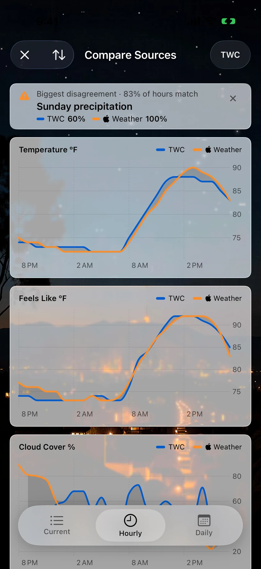
Where both sources agree, the forecast is worth more confidence; where they part is where to hedge. Choosing a source is described under Forecast Source.
The toolbar
- Menu button (top left) — opens the side menu with your saved locations, settings, and sharing. When Show Severe Alerts in Toolbar is on (Settings → Data & Layout → Alerts), an alert badge appears here during active alerts; tap it to read them.
- Location name (center) — also opens the side menu, so you can switch locations with one tap.
- Radar button (top right) — opens the full-screen Radar. Requires at least a Silver subscription; without one, tapping it shows the upgrade screen.
Tip: You can also swipe in from the left edge of the screen to open the side menu — no reaching for the toolbar required. Managing locations is covered in Locations.
On iPad
iPad uses a split layout: the location list lives in a permanent sidebar on the left, and the forecast fills the rest of the screen in a two-column arrangement that adapts to portrait and landscape. Everything works the same as on iPhone — there's just no need to open and close the side menu. The Time Machine and Compare Sources bar sits directly beneath the daily forecast panel, so it is always in reach rather than scrolled past the fifteenth day, and the toolbar alert badge opens the alert list in a popover anchored to the button.
